Preparing your files for print Formatting Guidelines
When your files are properly formatted and print-ready, your project breezes through our 4-stage printing process, and ends up exactly how you imagined.
Review our 6 formatting tips to save time and get to print faster!
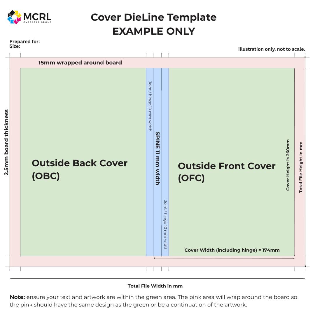
1. REQUEST DIELINE TEMPLATES
Before you begin formatting your print files, we strongly recommend requesting our cover dielines.
A dieline is a template that shows the exact location of trim lines, fold lines, and bleed areas.
We provide dielines as a guide to help you properly position your artwork and text, avoiding common formatting mistakes that may cause layout issues or require adjustments after submitting your files.
More Info2. DESIGN IN SPREADS
When laying out your artwork and formatting, it’s best to use spreads (two facing pages). This helps you visualize how the book flows for the reader, and simplifies page count calculations.
One Spread = 2 Pages.
For smyth sewn hardcover books, your total page count (not including the inside and outside of the front and back covers) must be a multiple of 4. For all books other than board books, export the pages as a PDF in single pages.
Because your page count influences price, designing in spreads may help you see where pages can be combined.
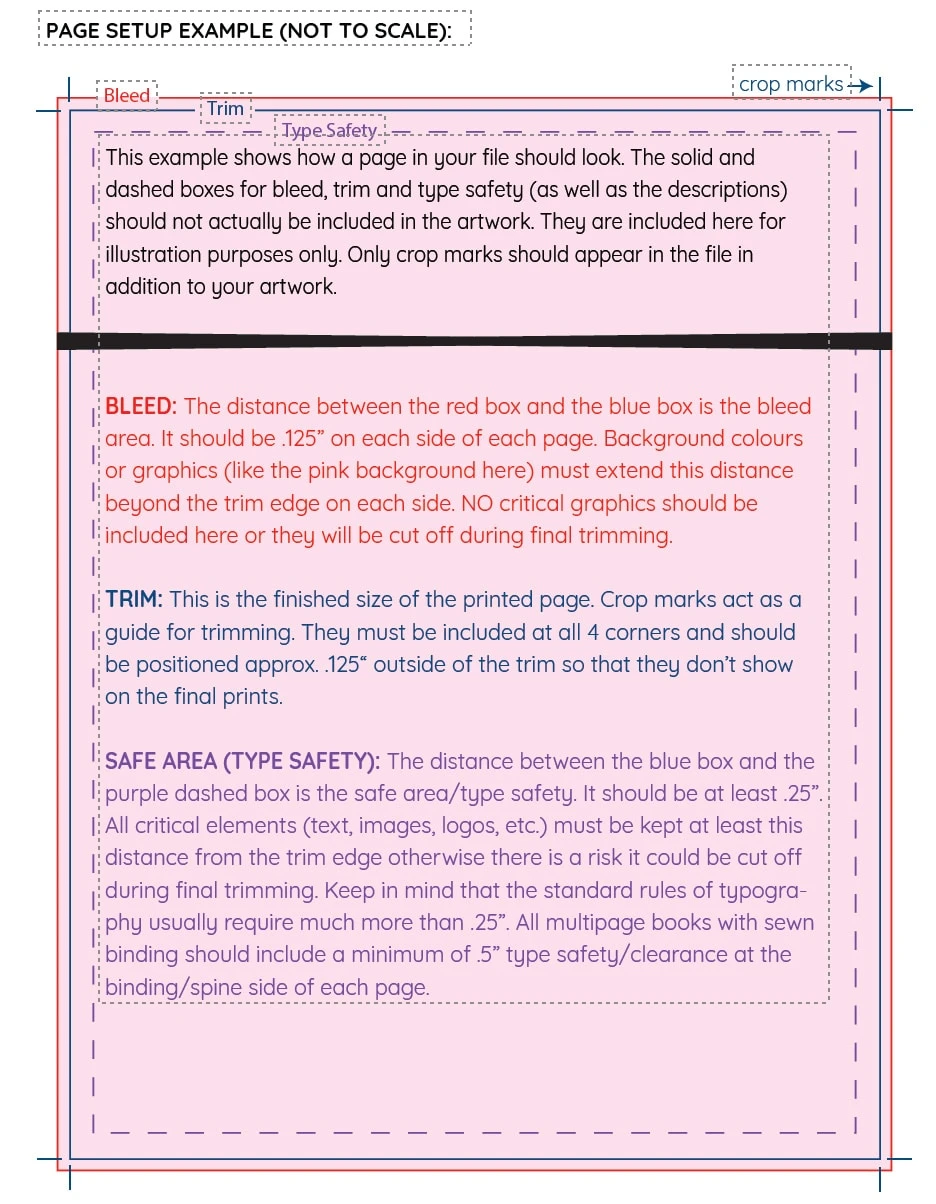
More Info3. ADD BLEEDS AND MARGINS
When preparing your files for print, make sure your artwork goes past the trim line to avoid white edges, this is called a “bleed.”
Most books need a 3mm (1/8") bleed on all sides.
Keep important text and images at least 6mm (1/4") inside the trim line so they don’t get cut off.
4. USE 300 DPI IMAGES
For crisp, professional-looking images when printed, your artwork should be at least 300 DPI (dots per inch). Lower resolutions can result in blurry or pixelated images.
When exporting your print-ready files, make sure your dimensions are large enough to maintain this resolution when printed.
5. EXPORT AS CMYK
Digital screens display color as RGB format, but printing needs CMYK (Cyan, Magenta, Yellow, Black) format to get accurate colors. Convert your files to CMYK before sending them.
If you send RGB files, we’ll convert them, but colors may look different so we recommend you convert and adjust before submitting.
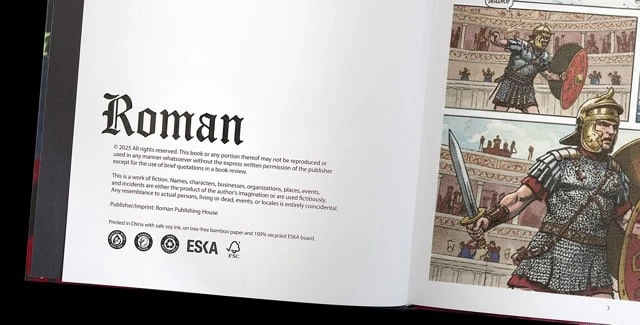
6. INCLUDE “PRINTED IN CHINA”
There is a “Printed in Country of Origin” Requirement when your book is printed and bound overseas.
To comply with U.S. trade regulations, your printed product must include a “Printed in China” statement.
This is typically placed on the copyright page, but it can also appear on the back cover or anywhere else in the book, as long as it is clearly visible and easy to read.
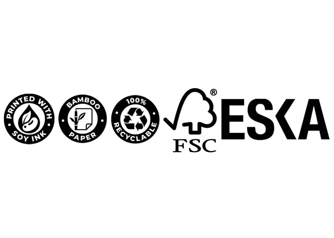
FREE ECO-BADGES WHEN YOU CHOOSE SUSTAINABLE MATERIALS
Highlight your commitment to the planet at no extra cost. Many of our clients choose to feature eco-friendly details alongside the country of origin—for example: Printed in China with safe soy ink, on tree-free bamboo paper and 100% recycled ESKA board.
Customize your own sustainability statement and proudly display the relevant eco badges in your project — completely FREE.


Download our artwork checklist
By following these formatting guidelines, your printing experience will be smooth from pre-production to the final reveal.
Have a Question? We’re here for you!
Schedule a meeting with one of our Printing Specialists
Need a hand with formatting? Check out our trusted print design pros.
Approved Your MCRL Quote?
Great! The next step is to submit your files here. Our VP of Print Production will personally review your files and get in touch if there are any issues or suggestions to help ensure your project prints beautifully.
We want to be more than just your printer. We’re your partner. Our goal is to ensure you have a smooth, positive experience with a printed product we are both proud of.
Testimonials
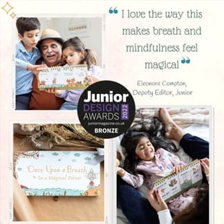
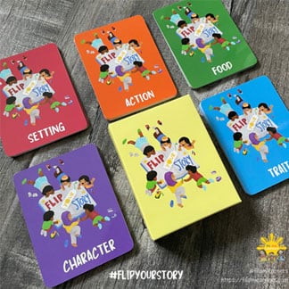
Neha & Tina authors of award-winning flipbooks for mindful moments
“Just wanted to drop you a note to say THANK YOU for helping us create our (Flip & Flow) book the way we wanted to. It has landed us an award for “Best Designed Book for Children”! Thank you for ensuring the quality and craftsmanship really made the book something to treasure. We will be in touch soon regarding the next edition :)”
Michele filamlearners.com
"The team at MCRL is extremely helpful and did an excellent job bringing the vision of my product to life! They did a thorough job ensuring the details of my project were carried out. I was sent a proof as well to ensure all the details met the expectations and allowed room to make edits as needed. They helped me through each step of the way of the process and I appreciated their transparency and continuous communication of what to expect- all the way to the arrival and shipment of the finished product at my doorstep. Thank you MCRL Group!”

Antonia King ZOOGA YOGA
"I am very excited to release my first children’s book MY MAGICAL RAINBOW! And my first set of ABC Zooga Yoga cards, YOGAPLAYR. From start to finish, Carol at MCRL provided excellent service, mentorship, and brought my products to the finish line. I am 100% satisfied with MCRL and would recommend them to anyone looking for personalized service, attention to detail and excellent printing. I can’t wait to write my next book and print with them. And thank you to Jamie for adding extra ease to the shipping process. 5 stars!”
Google Reviews

Laura Golben
"Fantastic experience working with MCRL! My business partner and I were looking for a printer for our children’s book for a while. We have a novelty lift-a-flap and that seemed to trip up most places we talked to, but it wasn’t a problem at all for MCRL. We are thrilled with the final product, the price per unit, and the customer service we received along the way. We will definitely be using them again in the future.”
Bailey Cronin
"I had been looking for a printing company for my book for a while and was referred to this company by my editor. I could not be happier with the final product! The quality of the finished books and book boxes were incredible and extremely professional looking! Jamie and Fabrizio at MCRL were so helpful and knowledgeable in guiding myself through this process to create the perfect book. I can’t recommend them enough to anybody looking to self publish their own book!"
S. J.
"MCRL is a dedicated team of uber-professionals who dedicate more time, consideration, and care to what even the smallest clients need than one could ever reasonably expect. They walked me through the process start to finish, had endless patience, utter insight, and incredible attention to detail. Not to mention genuinely caring.
Each person appears to care about doing a good job simply out of principle, because they are the kind of people who value doing a good job. There is a lot of kindness there, yet also efficiency - no nonsense, no wasted communications, yet never a moment when you don't feel you are in good hands. They wanted me to be happy with my product and they wanted me to get a great result.
You can trust their advice, as they have been doing this quite some time. When I needed to know specifics about textures and colors and such, the answers I got were accurate. They also helped me to address considerations I would not have known about on my own.
Not only are the people at MCRL - let's name Josh, Carol, and Jamie - wonderful, but the product is equally fantastic. I could not believe how much it exceeded what I would have expected even in the best case scenario. There's really nowhere else to go because I can't imagine anyone else getting such exquisite results on the given budget. I have not even one tiny complaint or wish for things to have gone differently, because the experience was pretty much ideal."