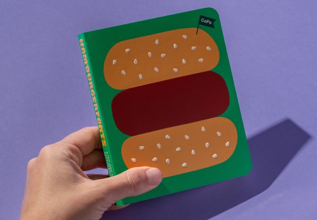
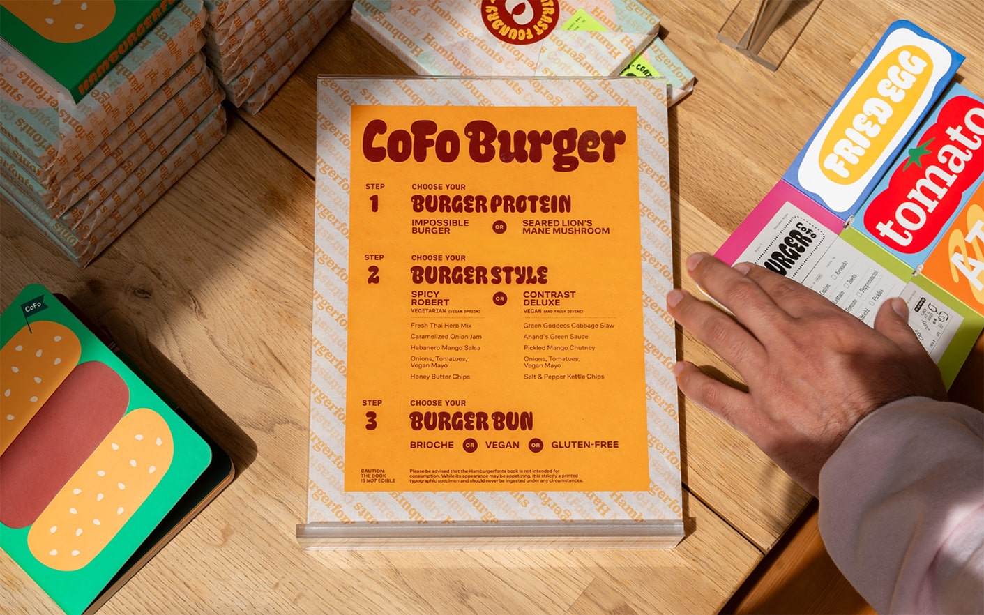
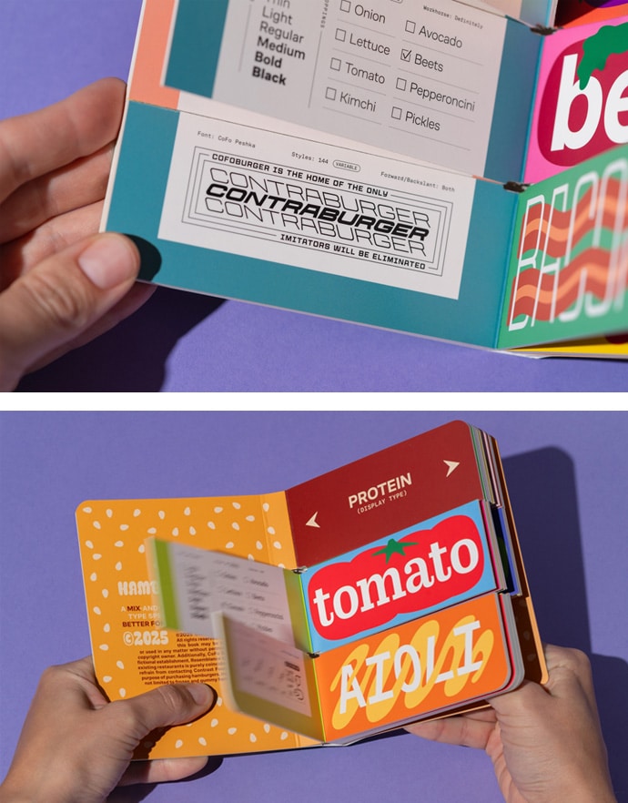
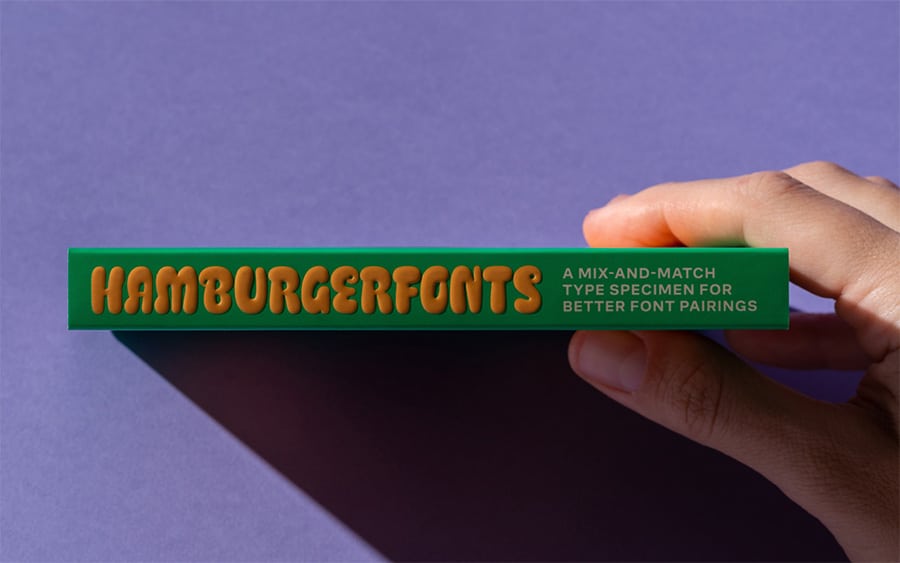
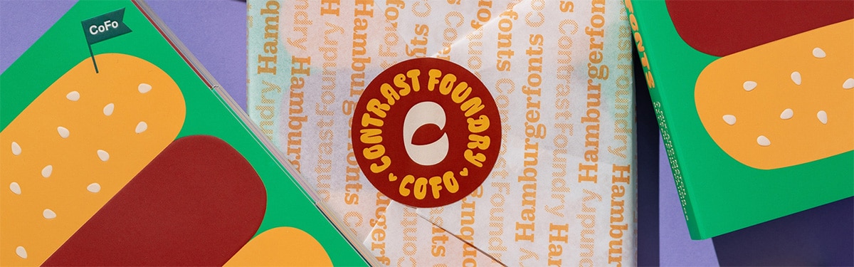
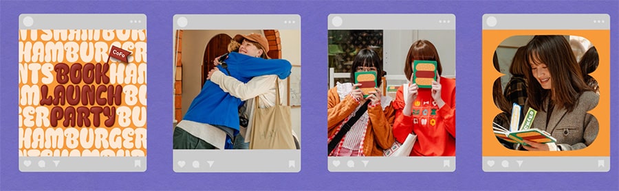
Contrast Foundry (CoFo), a San Francisco-based type design studio, teamed up with their creative partners — The Office of Ordinary Things and MCRL - to print a book that gets designers hungry to use Hamburgerfonts in their own projects. The Office of Ordinary Things had a cool concept: Utilize the format of a children’s inspired board book to bring Contrast Foundry’s Hamburgerfont typeface to life in a fun, interactive way. The result? A playful, hands-on mix-and-match board book where every flip of the page invites designers to explore different types of pairings. Organized into three tasty categories — Protein (Display Type), Veggies (Body Type), and Condiments (Supportive Type) — each font is paired with a custom illustration and a restaurant-inspired description. Creating a low-carbon printed product was a top priority for the team — from the board book itself to the packaging, every detail was designed with sustainability in mind. Materials: Ink: Finishes: To reinforce the hamburger concept, a food-safe custom wrapper was printed to protect the book, creating a fun unboxing experience AND doubling as a wrapper for burgers at the launch event! The overall result is a delicious typographic creation that educates, and engages designers about the versatility of Hamburgerfonts. To top it all off, The Office of Ordinary Things cooked up a head-turning campaign that introduced Hamburgerfonts to the design world. The offbeat, bold and unforgettable campaign @contrastfoundry launched Hamburgerfonts into the design world with a sizzle! Give them a follow!
CREDITS Book Author: Contrast Foundry Typefaces Photos and Promotions: The Office of Ordinary Things Printing: MCRL Overseas Group / <a href="https://boardbookprinting.com/" style="color: #005cae; text-decoration: underline; target="_blank">boardbookprinting.comClient Story
Contrast Foundry & The Office of Ordinary Things Hamburgerfonts
@contrastfoundry and @tooot.sf

Eco-Friendly Board Book Specifications
Food-Safe Packaging
Open search